
Insights
Less Talk, More Traction 
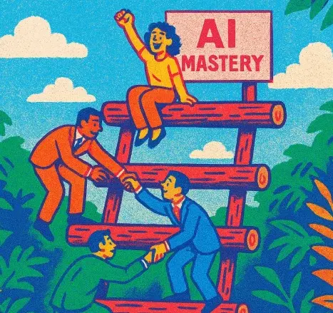
Accelerating AI Adoption for Your Business

The Fog of Vendor Fatigue
Finding Clarity in the Chaos

Burned Out
How Product and Engineering Teams Can Find Relief.
Resource Constrained?
Strategic software partnerships: innovate, save, overcome.

Getting Unstuck
When your software development partnerships falter

Beyond Specialization
The case for cross-industry software partners
Business vs. Tech Debt: Which is Growing More?
The case for a product audit

Accelerating Innovation
Move your ideas from concept to reality faster

Choosing the Right Software Partner
8 principles to guide you

Bridging the gap
Aligning Business Strategy and Software Development

Customer Conversations
That drive winning products in the market

Strategic Speed
When to accelerate and when to pace your software development
Incremental and iterative software delivery
What business leaders need to know in 2025

Resource Title
Ipsum consequat nisl vel pretium lectus quam id.
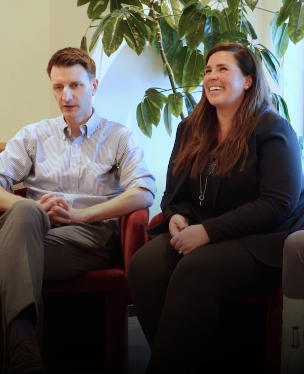
Customer Stories
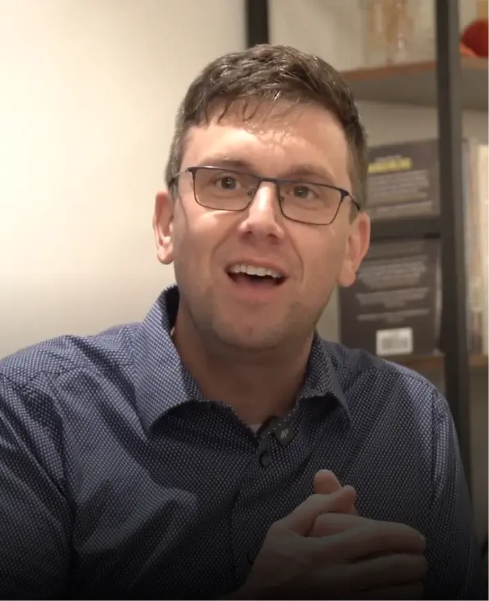
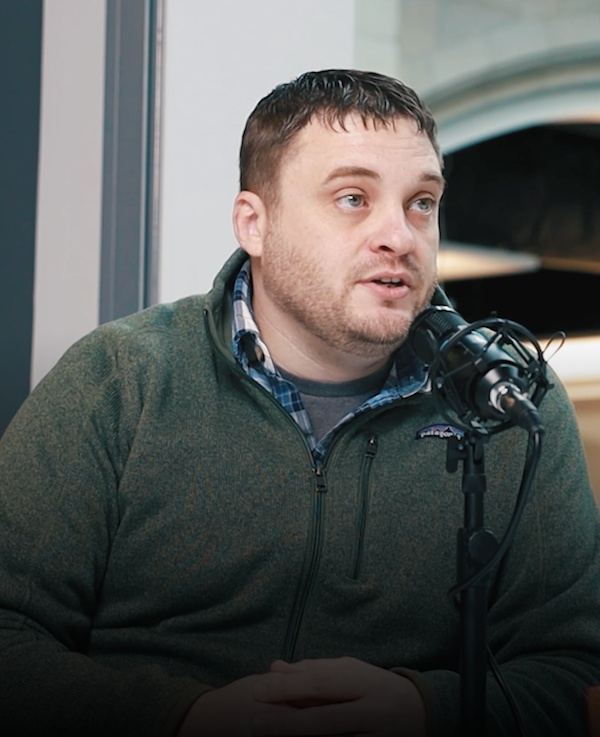
What is Smeeple?
Smeeple founder Calvin Holston provides an introduction to Smeeple – an innovative two-sided marketplace.
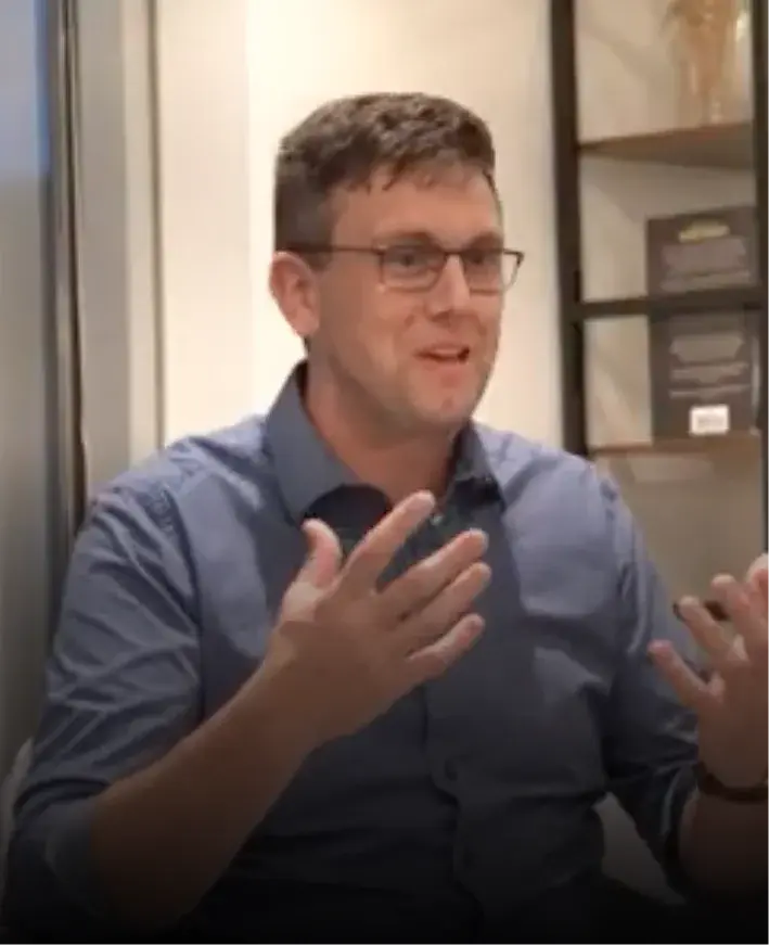
Working with Truefit
Smeeple founder Calvin Holston shares his experience working with a Truefit product team.
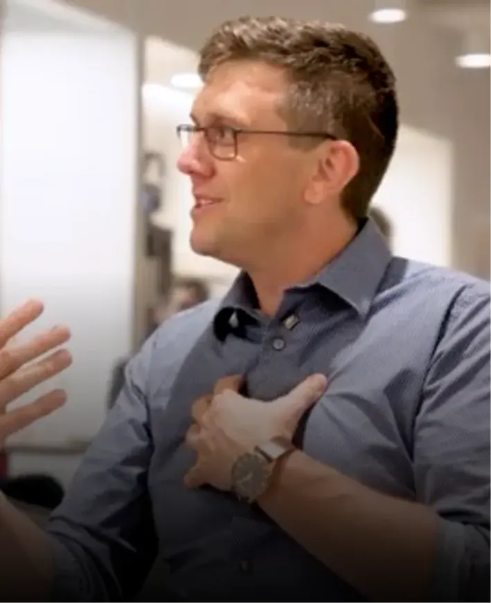
Smeeple's vision
Truefit's early customer development research informed evolutionary changes to the product vision and UX.

What goes into the product?
Learn how industry trends and insights shaped key decisions for creating a software product.

Understanding what works
Smeeple shares insights on what proved effective in their journey and what they wish they'd known.

Developing customers
Learn how Smeeple expanded its customer base using strategic client acquisition and onboarding.
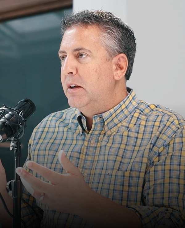
Intro To Flaherty & O'Hara
An introduction to Flaherty & O'Hara's business operations and expertise in alcohol law.
Future Of Evergreen
How Flaherty & O'Hara plans to grow and evolve after streamlining operations with new software.
Key Business Impacts
Flaherty and O'Hara discusses business improvements after implementing tailored software.
Product Journey
How Flaherty & O'Hara's software platform evolved to meet their business needs.
Software Introduction
Exploring how custom software transformed Flaherty & O'Hara's operations.
Working With Truefit
How Flaherty & O'Hara found success working with Truefit's cross-functional product team.
Resource Title
Ipsum consequat nisl vel pretium lectus quam id.
Idea Launch
.webp)
Outcomes Over Outputs
Focusing on understanding the problem for effective software solutions.
.webp)
Prioritizing Risk
Learning about prioritizing key risks and user needs when it comes to software development.
.webp)
Alignment & Budget
Balancing key tradeoffs and strategically budgeting for software project success.

Product Market Fit
Aligning software with evolving market needs to ensure optimal product fit and success.

Success Factors
Aligning teams, understanding risks, and focusing on users to produce a successful product.

The Importance Of Identifying Risk
Why identifying risks is crucial in software development.

Understanding Risk: Value & Usability
Balancing software value and usability for effective solutions.

Understanding Risk: Feasibility & Viability
Evaluating feasibility and long-term success in software projects.

Alignment & Vision
Understanding the importance of testing assumptions and aligning visions with agile discovery methods.

Defining The Problem
A clear understanding of the problem is crucial before beginning to generate solutions.

Discovery & Problem Solving
Using discovery to ensure effective and accurate problem-solving.

Prototyping & Next Steps
An introduction to prototyping in order to visualize and refine software solutions.

Risk And Discovery
Exploring potential risks and testing innovative solutions through a thorough discovery process.

Team Alignment
Aligning teams effectively through collaboration, workshops, and shared goals.

Understanding & Framing The Problem
Framing and understanding the customer journey for solutions.

Quantitative & Qualitative Testing
Using surveys and interviews to enhance product testing.

Understanding The User
How understanding user needs and empathy shape the software development process.

Decision Making
Key elements guiding decision-making in software development for optimal results.

Defining Product Strategy & Maintaining Alignment
Aligning teams and product goals for business impact.

The Competitive Landscape
Analyzing competitors to inform software development strategies.

Understanding Context
Exploring how the software's context influences product insights and development strategies.

Understanding The Domain
Grasping the business domain for effective software development.
Unexpected Changes
Navigating how software evolves and adapts during the development process.

Generating Solutions
Turning a product vision into actionable steps that drive effective solutions and successful outcomes.

Navigating Feasibility Risks
Handling feasibility risks and technical constraints effectively.

Object Oriented UX & User Flow
Designing user journeys with object oriented UX principles.

Prioritizing Solutions
Assessing and prioritizing potential solutions to effectively reach desired outcomes.

Testing Critical Assumptions & Reducing Risk
Key assumptions for product success.

Visual Style Storyboarding
Utilizing storyboards to define and enhance user experience and visual style.

Implementing Visions & Becoming Aligned
Aligning goals and overcoming challenges to realize visions.

Learning From Testing
Learning from testing reveals key insights for effective software development.

Making Changes
Refining strategy by making software changes before the build phase begins.

Release Planing & Story Mapping
Addressing challenges with story mapping and release planning.

Validation & User Testing
Testing and validation is used to ensure that the software solves the right problem.

Implementing Product Changes
Implementing product changes as new insights reshape the build.

Cross-Functional Product Development Teams
Diverse roles on cross-functional product development teams.

Estimating Story & Feature Size
Understanding the process of estimating story and feature size.

Measuring Progress
Using quality as a key metric to measure product build progress and success.

Navigating Challenges
Understanding how strategic prep work helps teams navigate software build challenges.
Outside Influences On Product Direction
Understanding outside influences on the direction of product development.

Product Development Process
How the team organizes the product development process.